


What is an Infographic Poster? (Viral Images that Rank on Google)

An infographic poster is a visual representation of information, data, or a process designed to make complex ideas easy to understand. They incorporate visual storytelling and eye-catching design elements like illustrations, icons, and typography to make information more appealing and memorable.
But infographics offer much more than simply visual appeal. Let’s explore further why infographics are just the thing to put a pep in your content’s step.
Why Infographics are a Potent Content Marketing Force
Most people’s eyes glaze over when faced with walls of text and endless spreadsheets. We’re visual creatures that are wired to process images and colors much faster than words alone. That’s why infographics are such a potent tool in your content marketing arsenal.
Why? Well:
- Infographics are attention-grabbers. It can feel like our lives are destined for endless scrolling and information overload. Thankfully, a well-designed infographic stops thumbs in their tracks. The visual appeal instantly makes complex information more approachable and digestible. Suddenly, those dry statistics and boring data points transform into something that’s actually interesting.
- Infographics are inherently shareable. People love to pass on interesting visuals to their friends and colleagues, which means your infographic has the potential to reach a much wider audience than a typical blog post. This increased visibility translates into more brand awareness, backlinks, and potential customers.
- Infographics are memorable. Research shows that people retain visual information far better than text alone. This means that even if someone doesn’t convert into a customer right away, your infographic has planted a seed in their mind. They’re more likely to remember your brand and come back to you when they’re ready to buy.
Types of Infographic Posters (and When to Use Them)
Infographics aren’t one-size-fits-all. The type you choose should align with your message and the goals you want to achieve.
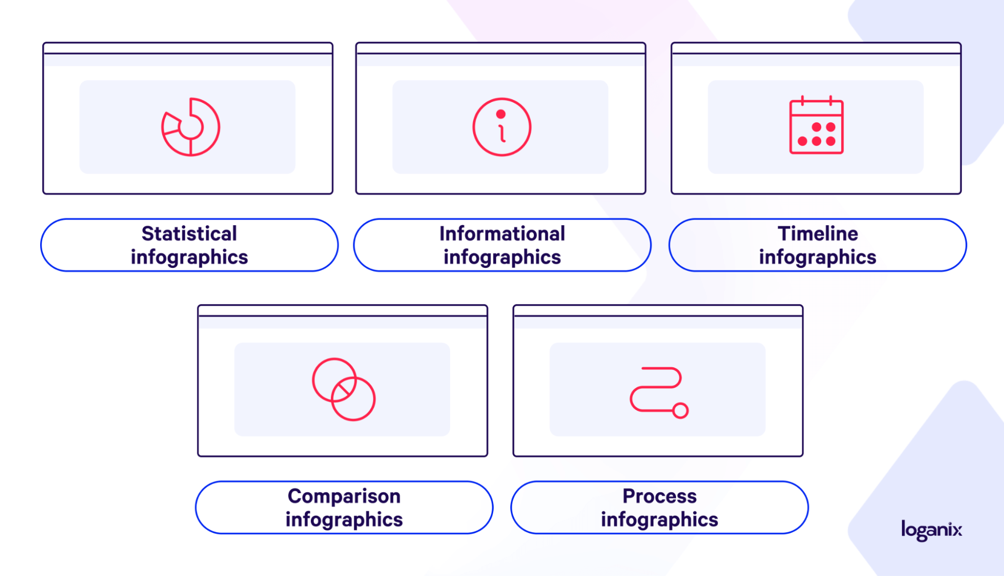
Let’s break down the most common types and when to use them:
- Statistical infographics are perfect for data-driven stories. Got a juicy survey or research results? Turn them into eye-catching visuals that make your numbers pop.
- Have a complex idea you want to simplify? You’re in luck. Informational infographics break down information into digestible chunks, using visuals and text to guide your audience.
- Timeline infographics showcase your company’s history, the evolution of a product, or the steps in a process. It’s a great way to tell a story chronologically.
- Comparison infographics highlight the differences (or similarities) between two products or ideas. This format makes comparisons easy to understand.
- Have a complex process to explain? Process infographics should be your go-to. They break it down into flowchart-style visuals.
How to Make an Infographic Poster (Without a Design Degree)
Thankfully, creating an infographic poster doesn’t require a fancy art degree or expensive software. With a little planning and the right tools, you can whip up an eye-catching visual that gets your message across loud and clear.
Here’s where to start:
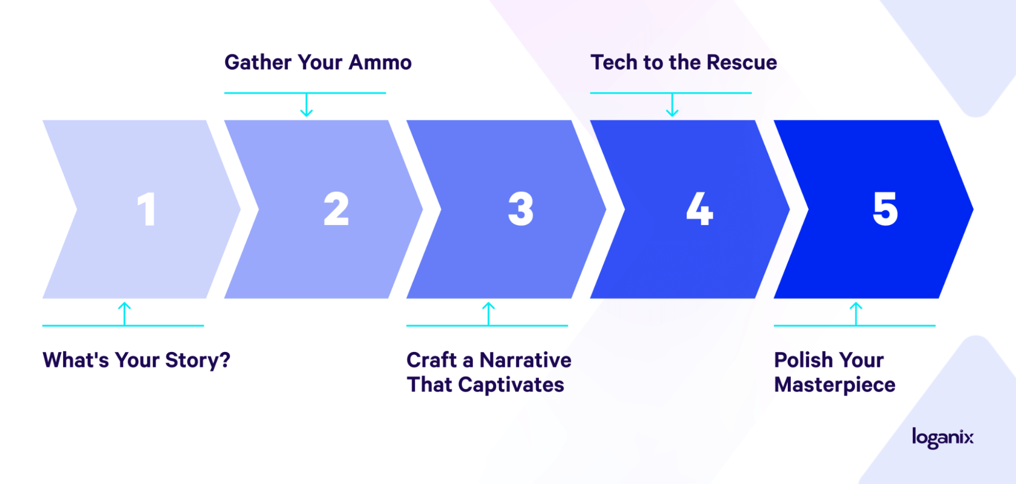
Step 1: What’s Your Story? (And Why Should Anyone Care?)
Before you consider starting anywhere else, let’s get real about your infographic’s purpose. Grab a pen and paper (or your favorite note-taking app) and answer these questions:
- What’s your core message? Are you trying to educate your audience about a complex topic, raise awareness for a cause, or promote a new product? Being clear on your core message makes conveying it to your audience that much easier.
- Who’s your target audience? Are you speaking to industry experts, potential customers, or a general audience? Understanding their needs and interests will shape your content and design choices.
- What action do you want them to take? Do you want them to share the infographic on social media? Visit your website? Sign up for a newsletter? Knowing the desired outcome will help you craft a clear call to action.
Step 2: Gather Your Ammo
Now that you have a laser-focused goal for your infographic, it’s time to gather the raw materials that will bring it to life. The angle here? To curate the most compelling, credible, and relevant information that supports your message and resonates with your audience.
Here’s where to find your infographic arsenal:
- Don’t just regurgitate stats everyone’s already seen. Dig into niche reports, conduct your own surveys, or analyze public data with a fresh perspective. Uncover surprising insights or trends that will make your infographic stand out.
- Quote industry leaders, influencers, or even your own internal experts to add credibility and authority to your claims.
- Incorporate testimonials and customer feedback. They humanize your data and create a deeper connection with your audience.
- Mine your sales figures, customer demographics, or website analytics to uncover unique stories and trends that only you can tell.
Step 3: Craft a Narrative That Captivates
With data and information in hand, it’s time to give it structure and purpose. But where do you start? How can you transform those raw ingredients into a message that grabs attention and holds it?
Start by mapping out a clear narrative arc. What’s the beginning, middle, and end of your infographic’s “story”? What’s the problem you’re addressing, the solution you’re proposing, or the insight you’re revealing? A strong narrative will guide your audience through the information in a way that makes sense, leaving a lasting impression.
Next, think about the best way to organize your content. Do you want to take viewers on a journey through time? Or perhaps a head-to-head comparison of two different concepts? If you’re explaining a complex process, a step-by-step flowchart might be the way to go. Each structure has its strengths, so choose the one that aligns with your message and the goals you want to achieve.
If you need to, refer back to the types of infographics section and select the one that best suits your use case.
Step 4: Tech to the Rescue
Creating eye-catching infographics doesn’t require a graphic design degree or expensive software. Tons of user-friendly tools exist that make the process a breeze, even for those who haven’t touched Photoshop since their MySpace days. In no particular order, here are the best in the business:
- If you’re looking for a simple, drag-and-drop interface with tons of free templates and design elements, Canva is your best bet.
- Need to bring your data to life with animated charts and interactive elements? Visme has you covered.
- For data-heavy projects that require professional-looking visuals, Piktochart excels with its easy-to-import data and robust customization options.
- And if you’re after a wide range of templates tailored for different industries, Venngage offers a user-friendly experience with plenty of inspiration.
Remember, most of these tools offer free trials, so you can test them out and see which one feels right for your needs. And don’t worry about getting stuck—all of these platforms have excellent tutorials and support resources to help you along the way.
Step 5: Polish Your Masterpiece (and Make it Shine!)
You’ve got your story and data. Now, let’s make it look as good as it sounds. Think of this as the final touch, adding those little details that elevate your infographic from “informative” to “unforgettable.”
Here’s where to focus your creative energy:
- Don’t just throw random colors together. Choose a color palette that aligns with your brand’s personality and the overall tone of your message. For a serious topic, you might opt for more subdued, professional tones. If you’re going for playful or energetic, then bolder colors might be the way to go.
- Typography matters. Choose one or two fonts that are easy to read and complement your design. Consider using different font weights (bold, italic) to create a visual hierarchy and guide the reader’s eye.
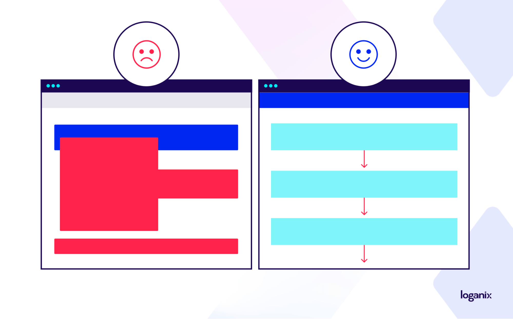
- What’s the most important information you want to convey? Create a visual hierarchy and make the most important elements stand out by using larger fonts, bolder colors, or strategic placement. Guide the reader’s eye through the information logically, using whitespace to avoid overwhelm.
- Don’t underestimate the power of subtle visual cues. Incorporate icons or illustrations to make abstract concepts easier to grasp and add personality to your design.
- If you’re using charts or graphs, use data visualization to keep concepts simple and easy to understand. Don’t overload your visitors with data points—the goal is to convey information, not confuse.
Infographic Posters and SEO: A Match Made in Google Heaven
High-quality, informative infographics are powerful linkable assets. People love to share interesting visuals, and website owners, bloggers, and even journalists are often on the lookout for data-driven content they can use in their own articles or social posts. The result? Your infographic poster could be featured on other high-authority websites, earning you those high-quality, rank-boosting backlinks.
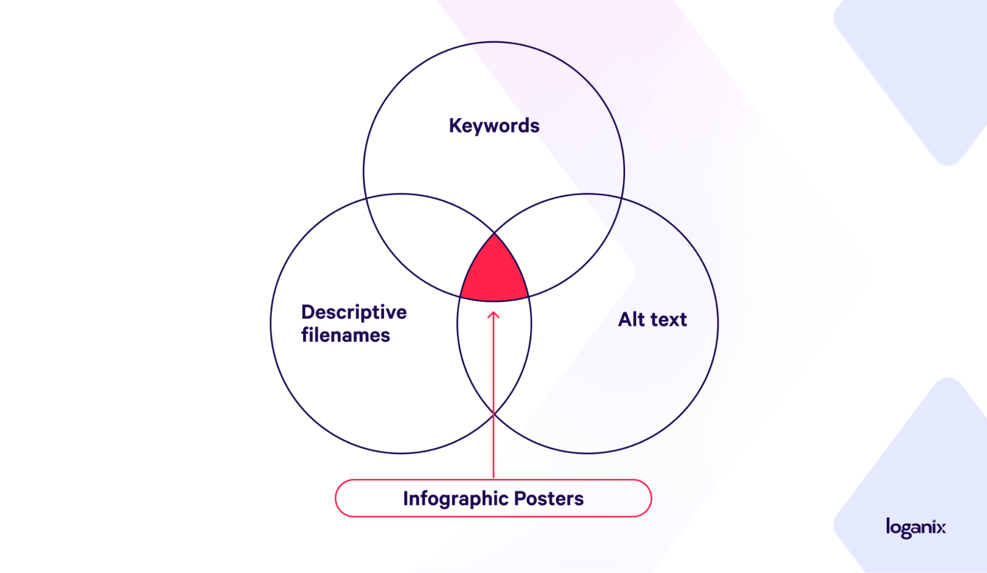
Search engines also love visuals, so optimizing your infographic for Google Images is key. This means using descriptive filenames and alt text (the text that describes your image to search engines), and choosing relevant keywords to tag your image with.
Social media is another area where infographics shine. People are more likely to share and engage with visual content, creating a ripple effect that can increase your brand’s reach and indirectly boost your SEO.
FYI: We offer a range of backlink services.
Conclusion and Next Steps
Alright, Picasso—you’re now armed with the knowledge to create eye-catching, informative infographic posters that will captivate your audience and boost your brand.
If you’re ready to kick your content marketing up a notch and ensure your infographics (or your client’s infographics) are pulling their weight, consider partnering with Loganix. Our team of SEO experts will help you develop a comprehensive (and, if needed, white-label) content strategy that’s optimized and just begging to be ranked.
🚀 Explore our SEO services and discover how we will help you achieve your goals. 🚀
Hand off the toughest tasks in SEO, PPC, and content without compromising quality
Explore ServicesWritten by Aaron Haynes on April 24, 2024
CEO and partner at Loganix, I believe in taking what you do best and sharing it with the world in the most transparent and powerful way possible. If I am not running the business, I am neck deep in client SEO.