


What Is Srcset? Mastering Responsive Images in SEO

You’ve probably heard the saying, “A picture is worth a thousand words,” but a poorly optimized picture in the competitive online world could cost you a thousand visitors—or worse, more.
That’s where srcset comes into play, offering tangible benefits that extend from search engine rankings to user satisfaction.
So your website isn’t plagued by a single responsive image problem, in this guide, we’ll
- tackle the question, “What is srcset?”
- discover why it’s crucial for SEO and enhancing user experience,
- and answer some frequently asked questions on srcset and its SEO and UX implications.
What Is Srcset in HTML? A Primer for SEOs
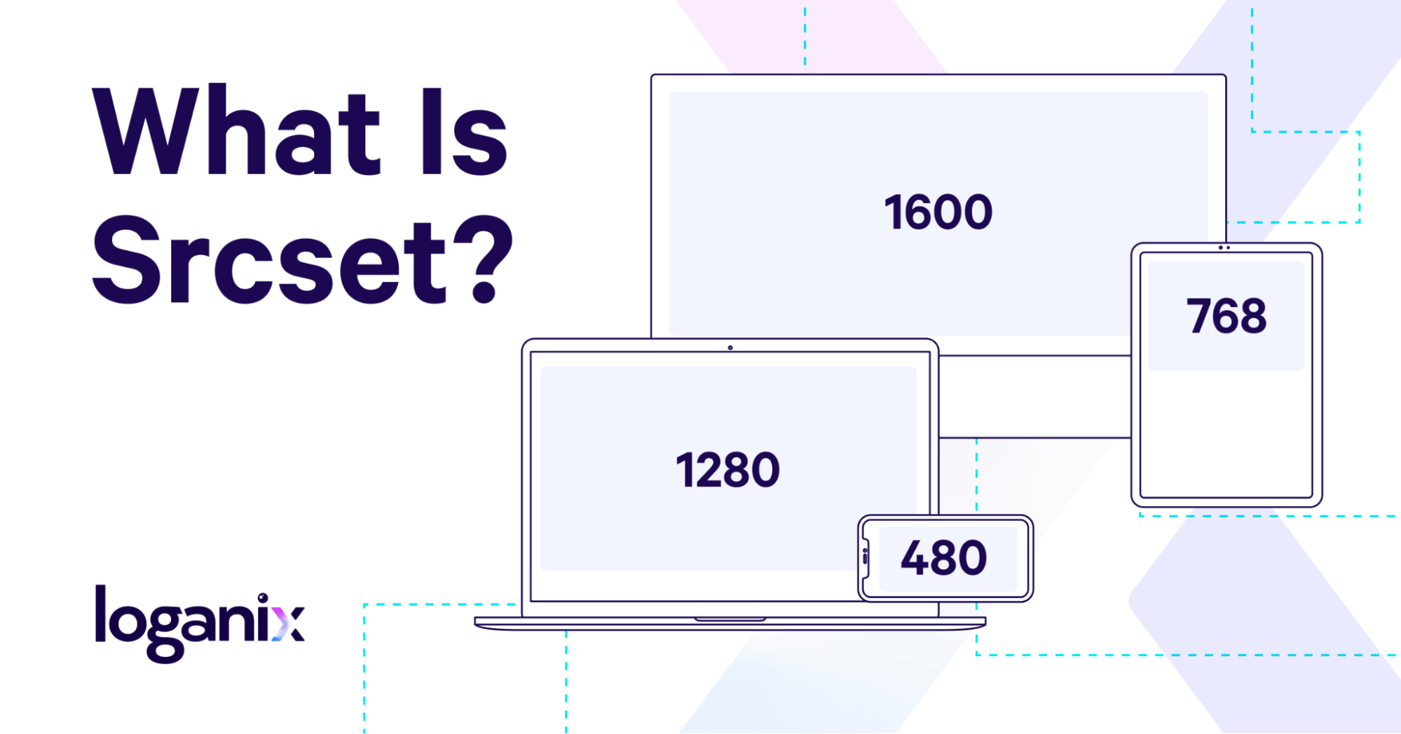
Srcset is an HTML attribute you’ll commonly find in <img> tags, the elements responsible for displaying images on your web pages. But what sets srcset apart from other HTML attributes is its unique role in optimizing images based on a user device’s unique screen size—think viewport width, pixel density, and device pixel ratio.
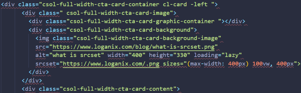
To give you a clearer picture, let’s dissect a basic example of how srcset works within a <img> tag:
<img srcset=”image-320w.jpg 320w, image-480w.jpg 480w, image-800w.jpg 800w”
sizes=”(max-width: 320px) 280px, (max-width: 480px) 440px, 800px”
src=”image-800w.jpg” alt=”descriptive alt text here”>
In this example:
- srcset lists different versions of the image, each with a width descriptor like 320w, 480w, and 800w.
- The sizes attribute specifies the image width to use based on the max-width of the device’s screen.
- The src attribute serves as a fallback, displaying image-800w.jpg if the browser doesn’t support srcset.
Here’s how it all comes together:
- The browser looks at the device’s viewport width and pixel ratio.
- It then uses the sizes and width descriptors in srcset to select the most suitable image.
And the end result? A visually stunning user experience without any compromise on load time.
Learn more: Interested in broadening your SEO knowledge even further? Check out our SEO glossary, where we’ve explained over 250+ terms.
Why Is Srcset Important to SEO, UX, and Beyond?
The challenge of delivering crisp, high-quality, responsive images across different devices like smartphones and desktops is multifaceted, affecting both search engine optimization (SEO) and user experience (UX). Factors such as diverse screen resolutions, bandwidth constraints, and pixel density often slow down page load times—a key SEO ranking factor—while also diminishing the user experience through slow-loading or poorly rendered images.
The SEO Angle
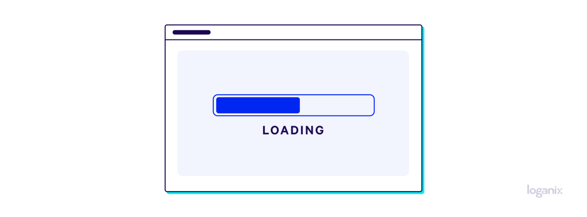
Let’s start with SEO, the lifeblood of any website aiming for visibility. One of the key factors that search engines like Google consider when ranking your website is page load time. According to a study by Google, a one-second delay in mobile load times can impact conversion rates by up to 20 percent. The faster your site loads, the better your chances of ranking higher. And images, especially high-resolution ones, can be the main culprits in slowing down your site.
Not to mention, Google has a whole set of metrics centered around UX—Core Web Vitals—that collectively act as a ranking factor.
Using srcset gives the browser a range of image options to choose from based on the device’s capabilities. These options ensure a mobile user on a mobile network doesn’t have to download the same high-res image intended for a desktop on a fiber-optic connection. As a result, mobile device page load times are improved.
Elevating User Experience
But it’s not just about pleasing the search engine bots—it’s also about delivering a seamless user experience. A survey by Akamai found that 53 percent of mobile site visitors will leave a page that takes longer than three seconds to load. Imagine a user pinching to zoom out from a pixelated image on their smartphone or squinting at an undersized image on their desktop.
Neither scenario is ideal for user engagement or conversions. Srcset takes care of this by allowing the browser to display the most appropriate image based on factors like viewport width and device pixel ratio. The result? Users who are happy to stay on your site, engage with your content, and maybe even convert.
Beyond SEO and UX
While SEO and UX are the most immediate benefits, the implications of using srcset go even further. For instance, it can save bandwidth for both you and your users. According to GTmetrix, optimized images can reduce overall page size by up to 80 percent, which could translate to lower hosting costs and less data usage for visitors.
Srcset FAQ
Q1: What Is the Maximum Length of a Srcset Attribute?
Answer: The maximum length of a srcset attribute is not explicitly defined by HTML specifications. However, it’s essential to keep in mind that excessively long attributes could impact your website’s performance. As a best practice, aim to include only the necessary image variations to cater to your audience’s diverse device capabilities.
Q2: What Is the Difference Between Srcset and the Picture Element?
Answer: Both srcset and the <picture> element serve the purpose of responsive image loading, but they differ in their use cases and capabilities. The srcset attribute is generally used for resolution switching—serving different image files based on the device’s screen size and resolution. On the other hand, the <picture> element offers more control and can be used for art direction. It allows you to serve entirely different images based on media queries, not just different resolutions or sizes of the same image.
Q3: Does Changing the Srcset Attribute Affect SEO?
Answer: Modifying the srcset attribute can have SEO implications, primarily related to page load times. As mentioned earlier, faster page load times are a ranking factor for Google. If you optimize the srcset attribute to serve more efficient, appropriately sized images for various devices, you could potentially improve your site’s SEO. However, incorrect implementation could lead to slower load times, negatively affecting your SEO.
Conclusion and Next Steps
Let’s be honest—SEO is a multifaceted game, and srcset is just the tip of the iceberg.
Ready to unlock the full potential of your website? Loganix is your go-to partner for a comprehensive SEO strategy transcending technical tweaks. Our all-encompassing SEO services cover everything you need for a high-performing website—from on-page optimizations and robust backlink strategies to compelling content that converts.
Don’t settle for just “good enough” when you can have exceptional.
🚀 Contact us, and let’s transform your well-optimized images into a revenue-driving, high-ranking website. 🚀
Hand off the toughest tasks in SEO, PPC, and content without compromising quality
Explore ServicesWritten by Brody Hall on February 6, 2024
Content Marketer and Writer at Loganix. Deeply passionate about creating and curating content that truly resonates with our audience. Always striving to deliver powerful insights that both empower and educate. Flying the Loganix flag high from Down Under on the Sunshine Coast, Australia.